It can be easy when
writing to sometimes fall into the trap of reducing visuals to
personal appearance, or a vague nod in the direction of setting.
Literary fiction conditions us to primarily consider feelings or
moods, and genre fiction devolves into a collection of stereotypes.
Some writers use visuals purely to repeatedly tell us how attractive
a character is, and other visuals end up standing in for an archetype
– witness the number of beefy barbarians or aristocratic vampires.
But can visuals play a bigger role, particularly in world building,
and help transport a reader into the setting that you’ve imagined,
rather than into their own interpretation?
I’m a big fan of
set design within films, and I think there is real potential to use
set design within novellas too – you’re not just ‘writing’
the setting, you’re ‘designing’ the setting. It involves a
little more conscious thought and planning about how rooms or
settings will look, and what impact those visuals will have on the
reader. Consider the way JK Rowling depicted Dolores Umbridge’s
office in Hogwarts – her cutesy obsession with pink and kittens was
possibly more monstrous even than her behaviour, but it was a deft
touch that helped to make Umbridge even more detestable.
Obviously you don’t
want to get carried away with the visuals. If you start describing
every single stick of furniture in the room, a reader isn’t going
to know what’s pertinent to the story, and they’re also going to
switch off from the story after being bombarded with description.
Anton Chekov came up with the idea, now known as Chekov’s Gun, that
if you hang a gun on a wall in act one, you’d better use it by act
three, or audiences (readers in this case) will wonder why it’s
there. You want to paint a broad enough picture that readers can
‘see’ the setting, but include enough details to foreshadow
future events and give away details about characterisation that’ll
save you from having to artificially describe them yourself. A room
with peeling wallpaper and damp patches on the ceiling lets us know
the inhabitant is slovenly and disinterested in his environment
without us having to ever say as much.
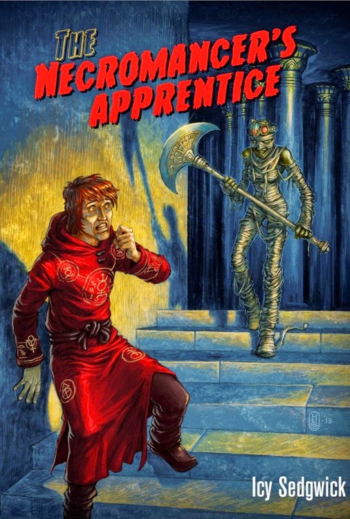
The visuals of The
Necromancer’s Apprentice are a bit of a mixed bag. The
Underground City, where we first meet Jyx, was based very heavily on
Mary King Close and the Blair Street vaults of Edinburgh. Picture
dank spaces, devoid of natural light, where the air is clogged by the
soot from gas lamps and the tall, narrow tenement buildings stretch
up into darkness. It’s a Victorian slum, inspired in part by Gustav
Doré’s nineteenth-century engravings of Whitechapel, where the
alleys are called ‘closes’ because they’re so crammed together.
By contrast, the part of the City Above that we get to see as Jyx
travels to the Academy is based on Venice, all quiet canals and
buildings with white shutters and delicate balconies, where Jyx can
see the sky. It seemed a good way to set the two spaces up in
contrast with each other, demonstrating the affluence and clean air
of one, and the poverty of the other.
Yet that’s not all
the visuals are for. True, they make good scene-setting, and people
can quickly ‘see’ what sort of locations these are, and they can
compare these imaginary locations with ones that they know in order
to form connections or draw conclusions. You can also hide clues in
the set design that like-minded people will pick up on, giving them a
satisfactory ‘a-ha!’ moment when they recognise something in your
design. When Jyx reaches the House of the Long Dead where he’ll be
working for the necromancer general, he finds a lot of the art
painted on the walls features figures drawn flat, in profile, which
was my way of referencing Egyptian art. The Wolfkin are descended
from Anubis, the Egyptian god of the dead, and he later discovers a
statue of a man with the head of an ibis in my nod to Thoth, the god
of knowledge. On their own, they just add to the set-dressing and
help to build an atmosphere, but anyone who shares these interests
will spot the references, and it should hopefully enhance their
enjoyment of the story.
Bio

Icy Sedgwick was
born in the North East of England, and lives and works in Newcastle.
She has been writing with a view to doing so professionally for over
ten years, and has had several stories included in anthologies,
including Short Stack and Bloody Parchment: The Root Cellar
& Other Stories.
She spends her
non-writing time working on a PhD in Film Studies, considering the
use of set design in contemporary horror. Icy had her first book, a
pulp Western named The Guns of Retribution, published in 2011,
and her horror fantasy, The Necromancer’s Apprentice, was
released in March 2014.
Links
Website:
http://www.icysedgwick.com
Twitter:
http://twitter.com/icypop